At the end of last year, we had been working on some side projects to allow us to experiment and have some fun. One of those projects was contributing to the open-source Shadcn - Rails Components project, which we will discuss in a future post. For now, I’ll just say that I was working on refactoring the tooltip component to work purely in CSS and remove all the JavaScript code.
In the original implementation, when a button was hovered, the component would add a bunch of CSS rules to the tooltip, including position: absolute. It wasn’t a hard task to convert the JavaScript code to a CSS rule.
I checked if the change caused any issues, and surprise! It did… The element with position: absolute just displayed a box with text. Before the change, the text showed up in a single line, but after, the text broke into a new line for each word. What happened?
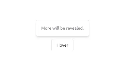 Expected result
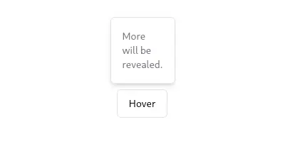 Result
Let me show you an example of how I investigate CSS rules behavior and browser API functionalities. Also, how I can ensure if it’s possible to use them in a project.
Why is this important?
From experience, I know the solution to the problem. We can simply add the white-space: nowrap rule to the element, push our changes, and ignore that this happened forever… but I think that we need to understand everything around a single line of code. It’s extremely useful to learn about the side effects of the changes we introduce to a project. Not only because it helps to understand the big picture, but also because it lets you anticipate and plan accordingly.
Know the compatibility
The importance of feature compatibility and whether a new feature is compatible enough to use in a project is crucial. Ensuring that a feature is widely supported across different browsers and regions can save a lot of headaches down the line.
These are the websites I use to ensure the features I’m using in a project are compatible enough for the target users.
Can I use?
Can I use is a website where we can check a feature’s support table across the most common browsers. We can check the compatibility of CSS rules, JS APIs, HTML5 elements, etc.
We can segment for a specific country like Argentina, France, or the US. This is helpful when you’re targeting to use a feature in a certain country or region.
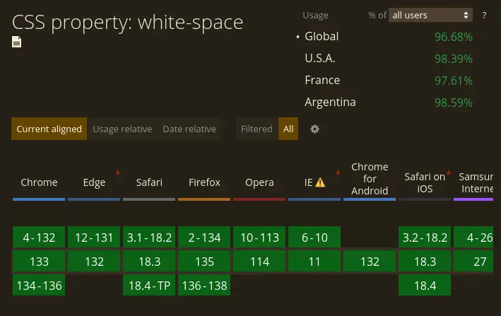
Good news! white-space has been with us from almost the beginning.
Baseline
Baseline, by Google, allows me to query and track features shipped in major browsers. It’s useful for knowing new web features. Even if you don’t use them immediately, it’s a good habit to check what’s new.
Informative and Documentation sites
When it comes to finding reliable information, there are a few go-to sources that I always check.
Mozilla Developer Network
Mozilla Developer Network (MDN) is a good source of information. It has a bunch of good tutorials about how to understand sets of rules. It provides detailed documentation on CSS properties, including examples and browser compatibility tables. For instance, when I encountered the issue with position: absolute, I searched MDN to understand why the text was breaking into new lines.
Unfortunately, I couldn’t find a reference for this behavior. So I moved to my next source of information.
CSS Tricks
CSS Tricks is a good place to see experiments with new rules and has really good tutorials. It often features articles that explore new CSS properties and techniques, providing practical examples and use cases.
Navigating through the site I found some posts speaking about how to deal with the weird behavior of position: absolute, but nothing about our issue.
Going unnecessarily deep
If I still haven’t found what I was looking for, there’s one more website to check. I leave it as the last resource because it’s too technical, which makes it a bit hard to read. And if you are like me, you can go through the rabbit hole very easily. The website I’m talking about is the W3C standards and drafts, the place where the W3C (the World Wide Web Consortium) standard is specified. If a behavior isn’t specified here then we found a bug we should report.
In this case, I found the W3C specification for the position rule, and the answer to my question was in Automatic Sizes of Absolutely-Positioned Boxes. In that section, there’s the technical specification about how the render size changes with position: absolute 🎉.
The answer to our question is that the absolutely-positioned box (the tooltip) is being rendered to fit its content as best as it can. The difference with the original implementation is that the JavaScript function that triggered the tooltip sets the width and height of the tooltip while the new implementation leaves the decision to the browser. By adding the white-space: nowrap rule, we’re telling the browser to display the text in a single line.
Conclusion
Investigating the behavior of CSS properties helps us avoid superficial solutions and write more robust code. Tools like Can I Use and official documentation allow us to make informed decisions. Instead of just applying a quick fix, understanding the root cause of the problem gives us a broader perspective on web development.